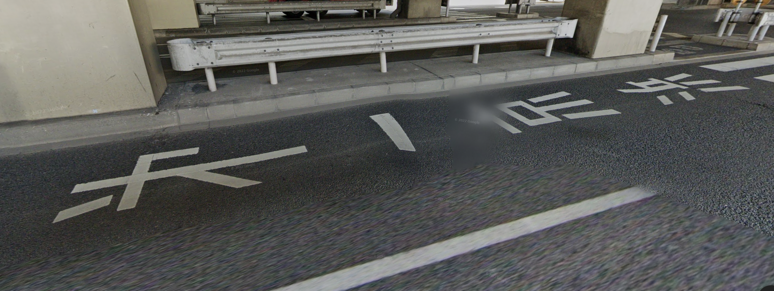
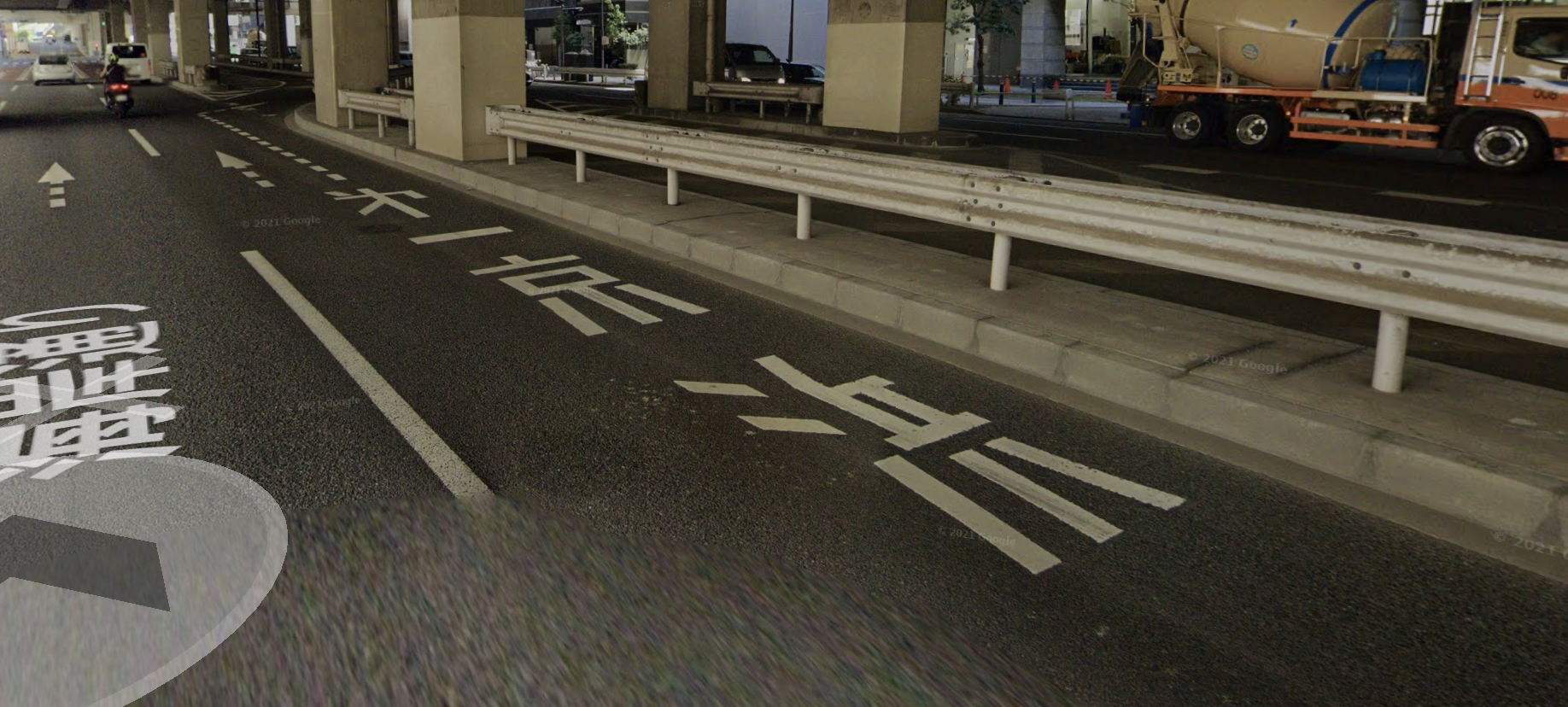
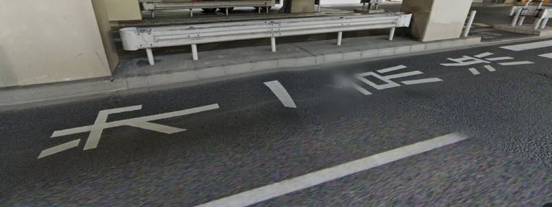
I was driving south on Kaigan-doori (海岸通り) in Minato-ku, Tokyo earlier today and was about to make a right turn onto Dai-ichi Keihin (第一京浜, a.k.a. National Route 15, connecting Tokyo and Yokohama) when I noticed the road markings directing cars to Dai-ichi Keihin had Dai-ichi Keihin written as 㐧一京浜 instead of 第一京浜. Of course, I couldn’t stop to take a photo, but I went on Google Maps later and found the markings using Street View:


Ryakuji (略字) are simplifications of kanji in the Japanese language, typically used in handwriting. 㐧 is used as a ryakuji for 第. Due to the advent of computers and typing, coming across ryakuji is not common in daily life, so it was a pleasnt surprise to see 㐧 today. What’s even more surprising is that this was not handwritten and was used in a rather formal context where 第 was certainly an option. The motivation to use ryakuji in handwriting is likely to save time and may have something to do with personal preference, so the decision to use ryakuji in a more formal context for something that’s meant to be read by many people is somewhat unexpected.
So what was the motivation behind using 㐧 here? Maybe it was for potentially improving readability; the strokes in 㐧 are certainly less dense. On the other hand, using this ryakuji when people are more used to seeing the full form of the character may also make it harder to read the road marking quickly. Ryakuji are not part of jōyō kanji list, and as people have less and less exposure to handwritten Japanese, it’s possible that the amount of people who can recognize this character is decreasing. It’s also a character that most foreigners studying Japanese would not learn. Some unfamiliar with Japanese or with ryakuji may even mistake 㐧 for 才 (sai) or オ (Katakana o), neither of which are related to 第.
I think I’ve seen 㐧 used in a similarly formal setting (printed on some road sign) once before, but it’s certainly rare. A quick search on Twitter brings up several more examples:
第の略字(㐧)をまさか使うとはね pic.twitter.com/99493h8GZq
— 藹筌苧 (@AA__iUEoHnn) March 30, 2021
腕を振って歩く人のような〖㐧〗 pic.twitter.com/4Dge2zN7Vr
— kirnura (Kim) (@kirnura) July 20, 2022
「第」の略字「㐧」を使った奥付。こういうのは珍しい気がする (自分調べ)。 pic.twitter.com/dbY6XjLFb2
— PICOROCO (@aof1080) May 31, 2021
1969(昭和44)年11月30日に京阪神急行電鉄から発売された「梅田駅拡張工事(第2期)完成記念入場券」5枚セットのうちの1〜3枚目です。
— yota8nsx (@yota8nsx) November 30, 2018
券面では第の文字が俗字の 㐧 になってますが表示できません。
5061の須磨浦公園行き特急はみなさん大好きな原型ですね。
万国博会場案内図とCTCセンターの図柄です。 pic.twitter.com/Sf0ZU1dntE
#SF映画を順にみます
— くまみ (@kumami_) February 5, 2022
「ガス人間第一号」(正確には「第」は略字の「㐧」)
1960年/日本(東宝)
監督:本多猪四郎
特撮監督:円谷英二
※感想はリプライ欄に続きます。 pic.twitter.com/Su5yT2qeSx
「㐧」って「第」の旧字かと思ってたけど「㐧」が新字で「第」の方が旧字なのに今でも使われてるんだ...
— 人肉はちみつ漬 (@nackart) July 14, 2020
第108回 「㐧」と「第」https://t.co/Q9yGkGZJtu pic.twitter.com/vfu39wklOB
Now how do OCR (optical character recognition) systems deal with this character? I did a quick test with two images from these Tweets using Google Lens
For one of these photos, Google Lens mistakes for 㐧 for 才 (sai), as I expected:
It’s interesting that Google Lens transcribes this as 第 instead of 㐧. Perhaps it has been trained to recognize 㐧 as 第 and does not actually map the visual shape of 㐧 to the separate Unicode character 㐧.
Further Reading
